Basic Lighting Design Paperwork

The technical materials associated with a lighting design will vary depending on the kind of lighting job, but the goal of lighting paperwork generally remains the same: To provide clear and concise information about the designs functionality to the electricians and the production team.

Below is an example of the lighting paperwork for an opera I was lighting designer for in undergrad. The basic paperwork for theatre lighting consists of:

  • A Light Plot in plan view
  • A section view
  • A channel hookup
  • A magic sheet

NOTE: This is a introductory guide. We will not be exploring the nuances of drafting, safe rigging and electrical practices, or fixture types. If you want to learn more please feel free to contact me.

A light plot is a plan view of the theatre showing where your lighting instruments will be placed. Most theatrical lighting instruments come with a pipe clamp attached to them so that they can be clamped anywhere along a steel pipe. Most theatres contain rows of these pipes installed specifically for hanging lights on, and each pipe is generally are referred to as an electric. Lights are then connected to electronic dimmers that are controlled with a lighting console via the DMX512 communication protocol.
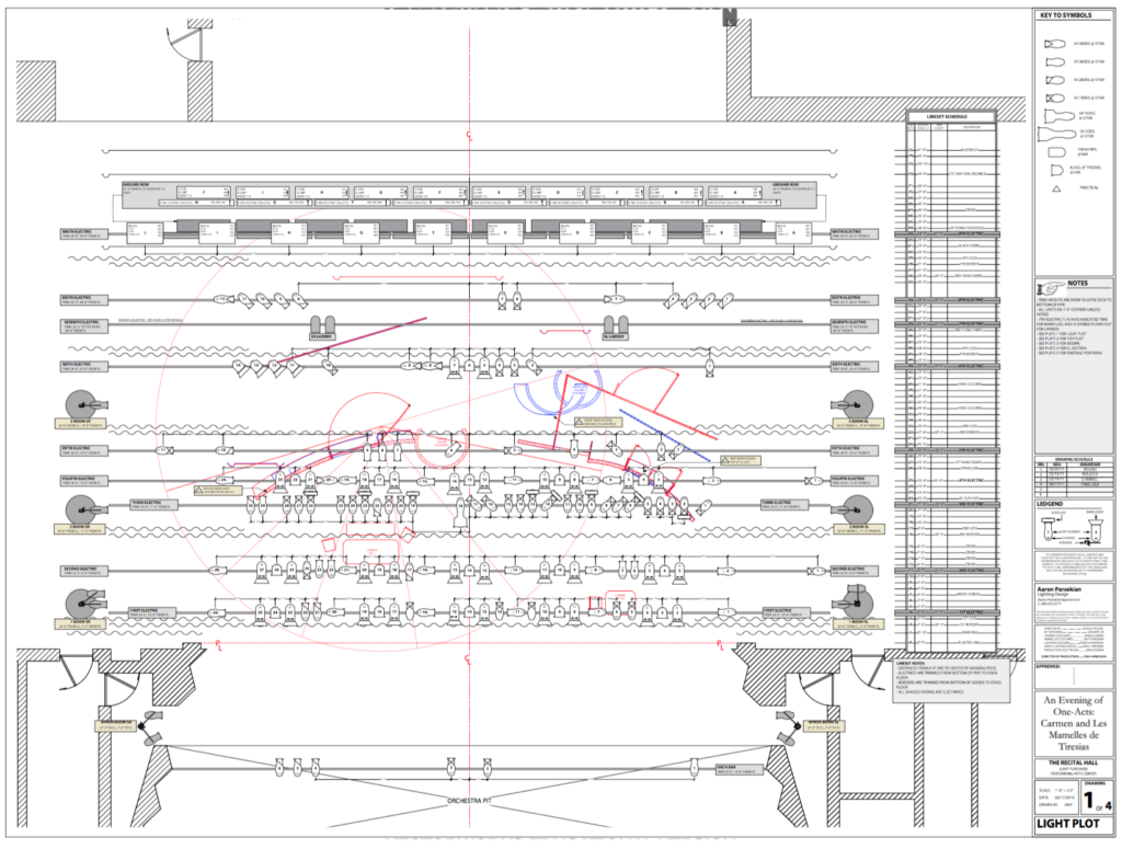
Example Light Plot

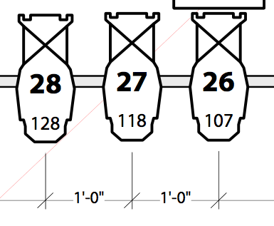
The light plot represents lighting instruments as schematic symbols. For instance these three instruments:

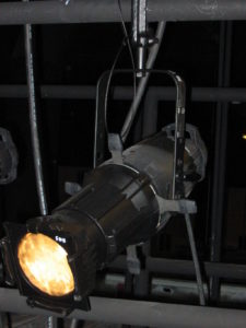
Are three ETC Source Fours with 19 degree lenses:

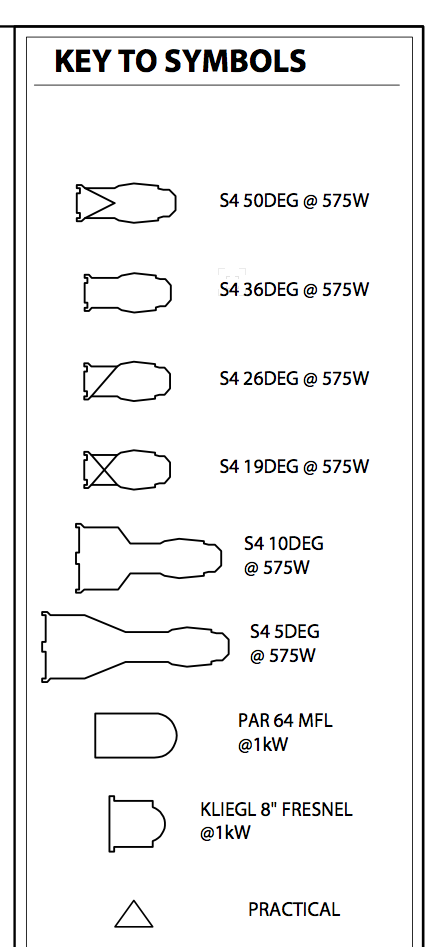
You can tell this by using the Key To Symbols, which is an important part of any light plot. The key to symbols defines every kind of light used in the lighting design:


In addition to a Key to Symbols, a light plot should also have a Label Legend. The label legend explains how the light is circuited, any associated accessories, and if it needs to be hung on the pipe in any special way:
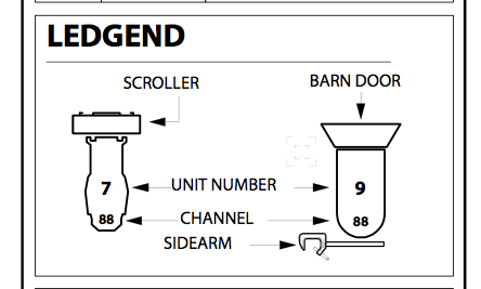
Looks like I couldn’t spell Legend correctly in undergrad! 🙁


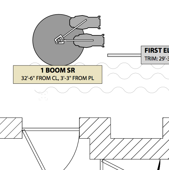
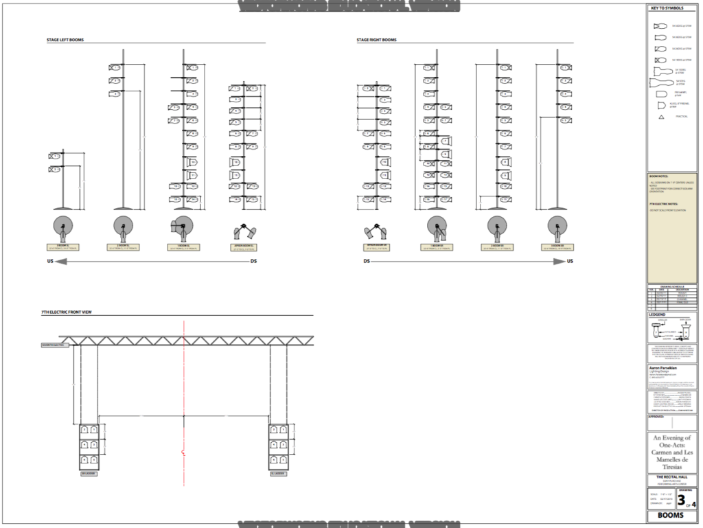
Sometimes lights are placed on vertical pipes called booms that extend up vertically from the floor. They’re probably called booms because of the noise they make if they were to fall over. If you don’t enough space on your light plot to draw them, they are generally represented by their footprint on the light plot and then drawn on a separate page as an elevation:


The first boom Stage Right is redrawn on another page as an elevation:


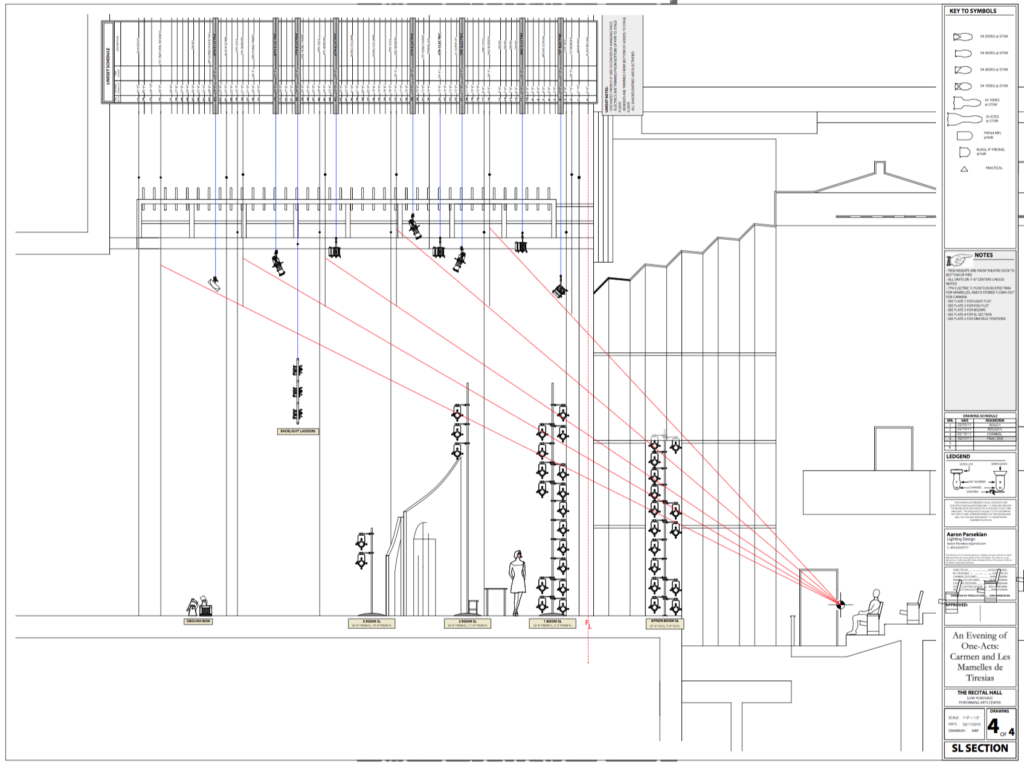
The Section View is a cross-section of the Theatre showing where the lighting instruments will be in elevation. Generally the section is “sliced” through the theatre on the centerline of the stage looking either to the left or to the right:

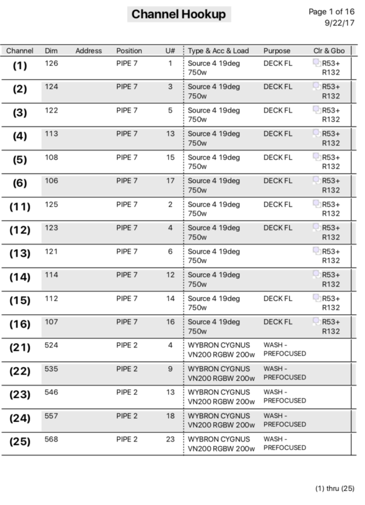
The Channel Hookup lists all of the lighting instruments, usually numerically by channel. Most lighting control consoles provide a second layer of organization after the DMX address called channels. These channels allow designers to group multiple DMX dimmers into a single channel, and to organize the light plot more coherently with the design goals. For example, you might place eight blue downlights in channels 11,12,13,14 even though they are plugged into DMX dimmers 18, 27, 34, 40. 
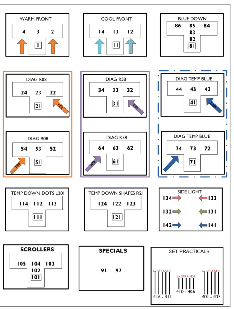
The Magic Sheet groups channels into design based groups. It serves as a shortcut to get lights on quickly. Instead of scanning an entire channel hookup or light plot to turn on all of the blue downlights, or to find a specific light pointed through a scenic window, the magic sheet is often the quickest guide to what lights are hung in the air
Counter app – User Testing

Our next assignment was to user test with the app we made. I used the functional prototype I made from proto.io to do this.

I had a lot of fun doing this. One of the challenges was making the prototype functional enough. People with smart phones are inherently used to things working smoothly, so the prototype’s functionality had to be as accurate as possible.

https://vimeo.com/207486741

It was also a humbling experience to find out what people did not like. After my first user testing, I went back and made some changes:

https://vimeo.com/207486661

https://vimeo.com/207486926

The Nature of Code – Physics / Animation final

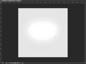
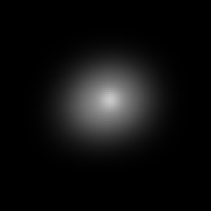
We start with one star made in photoshop with the feather tool:

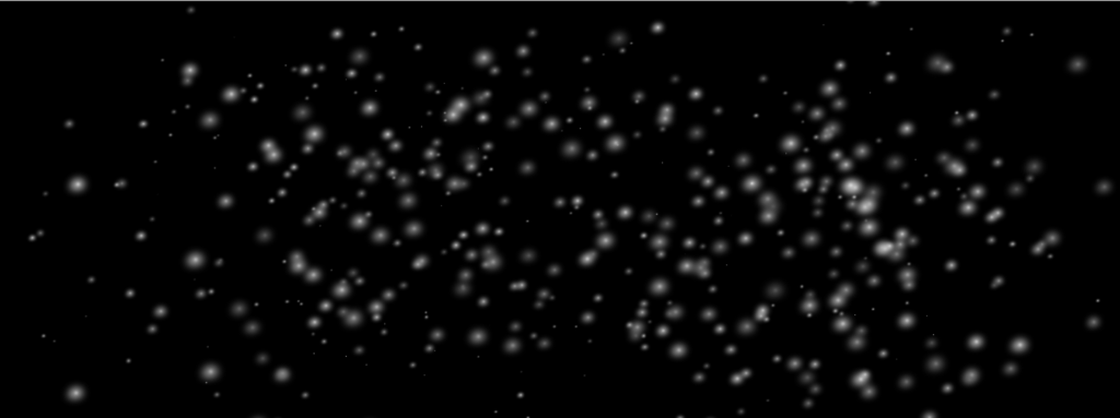
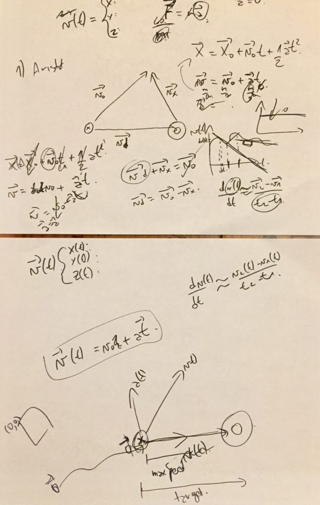
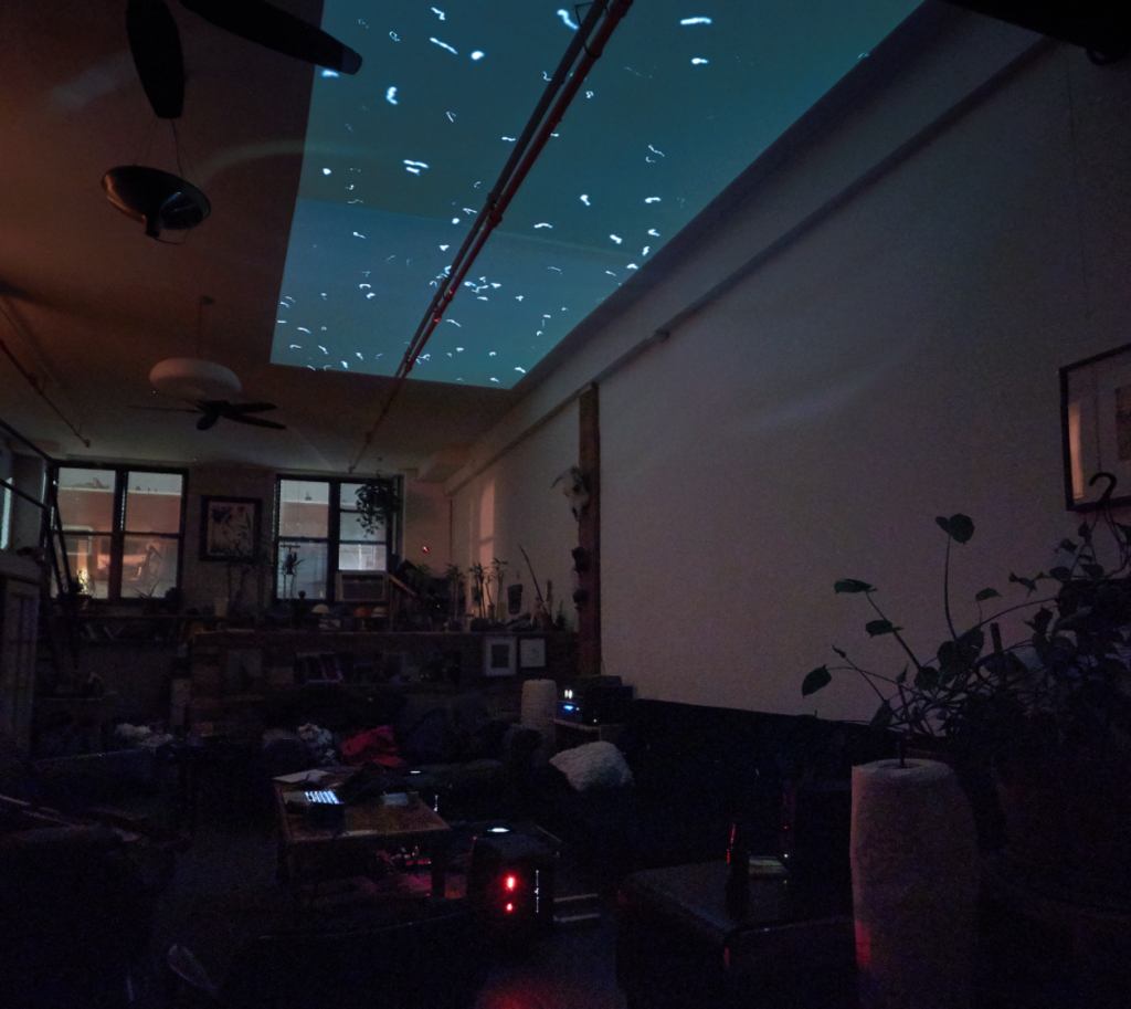
I wrote the sketch in processing. There is a class for the stars, which loads the star image above 500 times at random places on the canvas, of random sizes and random brightness’s for every draw loop. The stars are attracted to 500 invisible black holes. The attraction physics are based on the forces chapter in The Nature of Code. If you move the mouse to the left in the sketch, you can “disappear” the stars one at a time.

Huge thank you to fellow ITP student Aarón Montoya-Moraga for trying his best to teach me calculus for force vectors. Yikes!

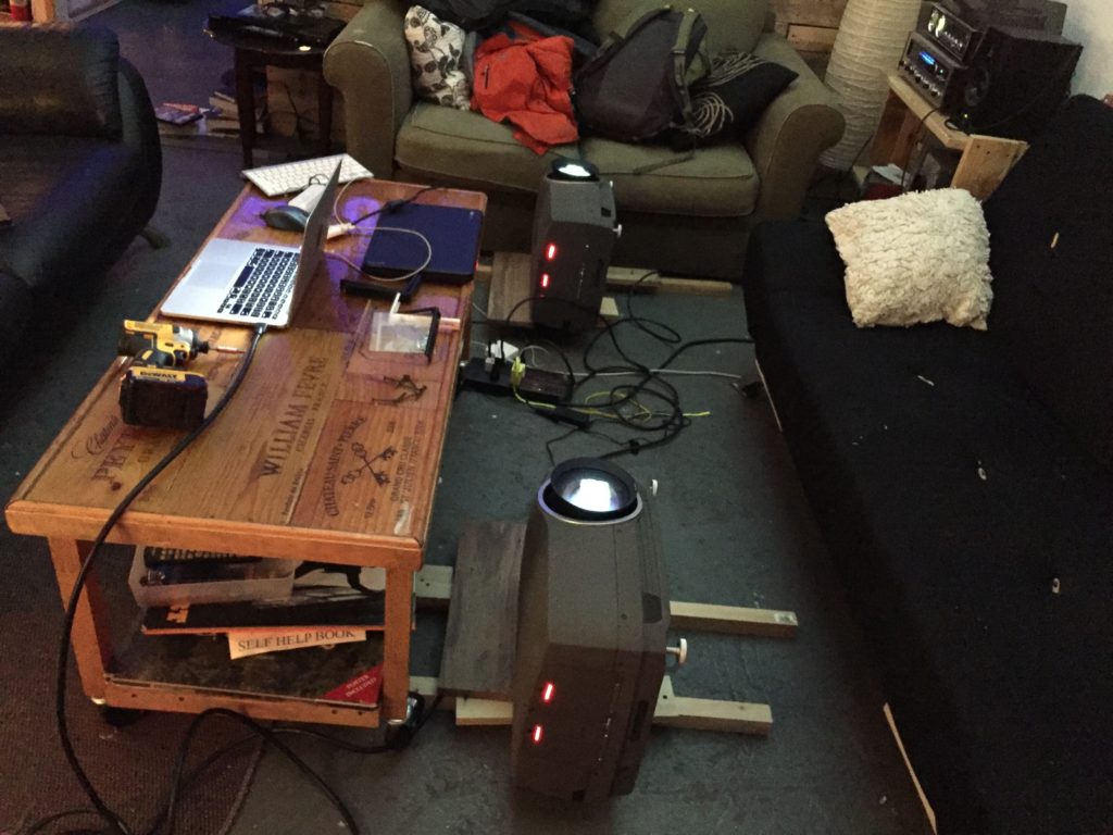
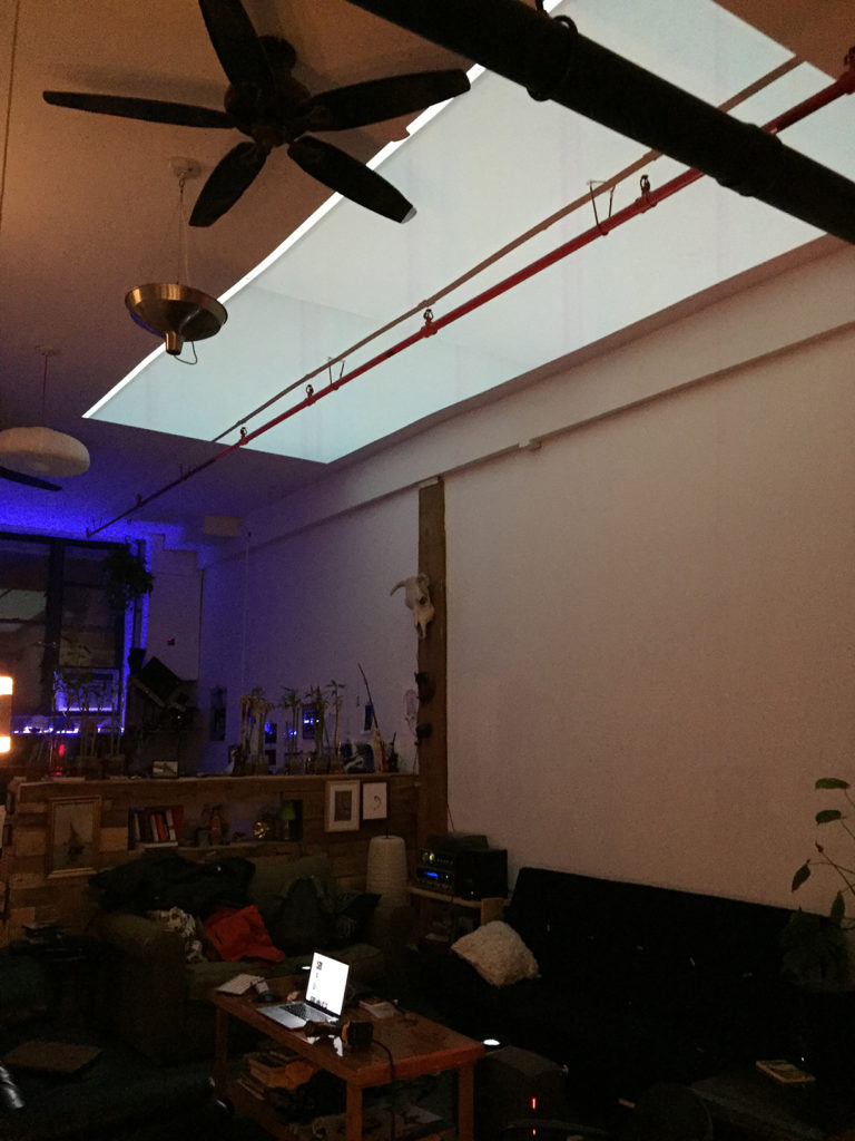
We decided it would be fun to project the star field onto the ceiling in my apartment with two projectors.


Here is the projects code on github!

https://github.com/aaronparsekian/project_constellation/tree/master/constellation


iPhone Counter App – working prototype

Our next assignment was to make our prototype for the counter app a little more functional. I decided to use proto.io to mock it up as a mobile app. It was a lot of fun to learn how powerful proto.io is in terms of making functional prototypes!

Here is a quick video of the counter app’s basic functionality:

https://vimeo.com/207378528

Nature of Code – physics and animation project

for my final project I would like to go in an extraterrestrial direction . . . .

I will be using a particle system to create an interactive planetarium that I can project onto a ceiling. My basic idea is to have points on a night sky that:

  • move slowly in a relative plane
  • are grouped into organic clusters
  • are of multiple size
  • twinkle or some variety of brightness
  • have some fun user interaction that effects either a portion of the particles, or maybe all of them?

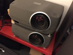
During a recent NYU dumpster diving trip, I came across two 6500lumen christie projectors. I think this will be a fun way to use them! I am lucky to have 14′ high ceilings in my apartment, so my ceiling will be a perfect place to project some star fields.

Someone crazy threw these massive projectors out!

For the user input, I would like to keep it simple. Something about a big trackball seems planetary 🙂

Some of the Nature of Code examples I would like to take advantage of are:

  • Attraction forces
  • Particle Systems
  • Motion acceleration forces
  • Fluid resistance?
  • Magnetism?

Counter Assignment – iPhone app


Our next iteration of the counter assignment was an app for a mobile phone.

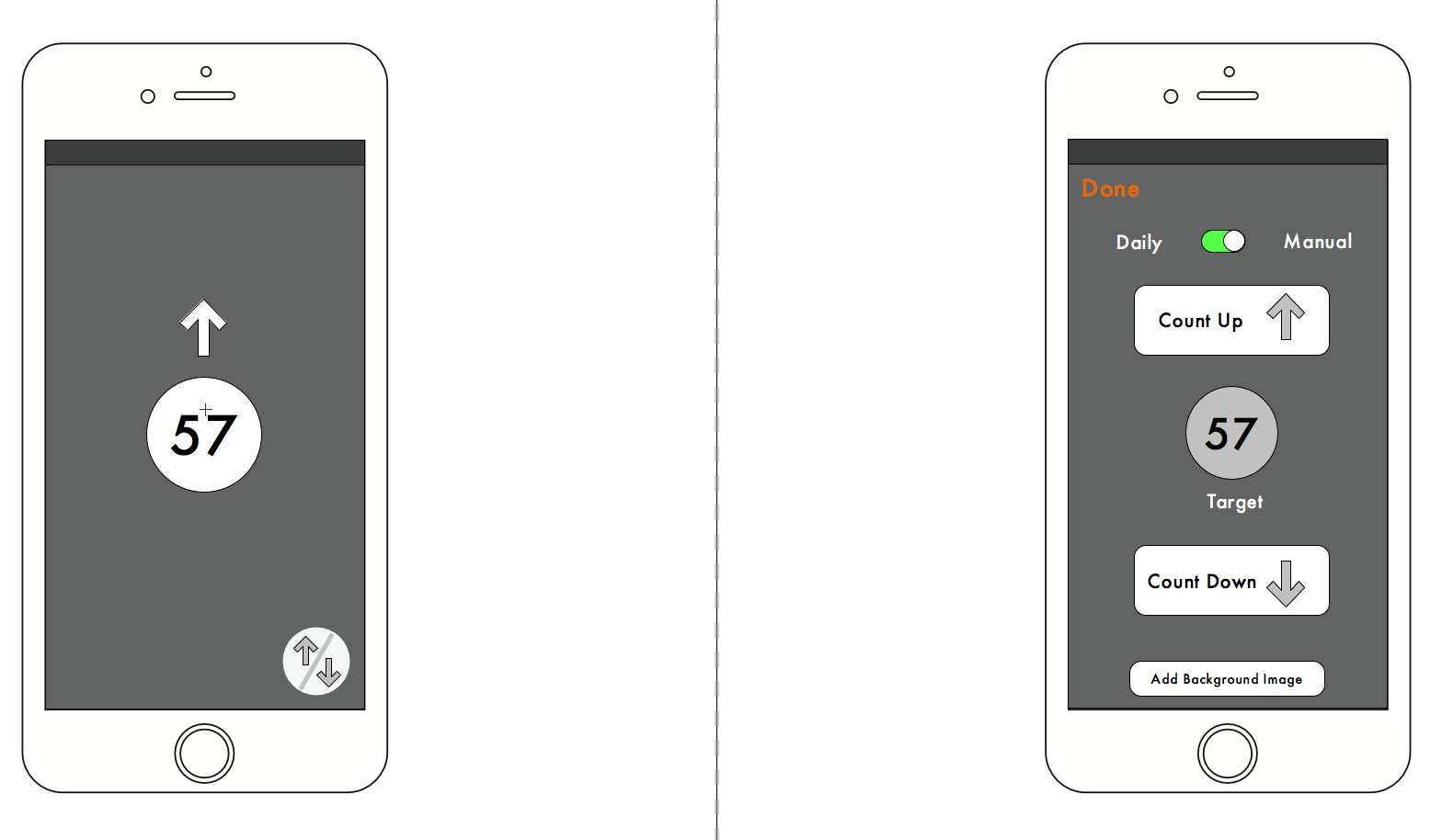
The app allows a user to count up or count down, and to set a target to count towards.

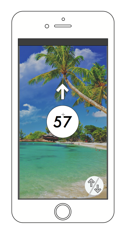
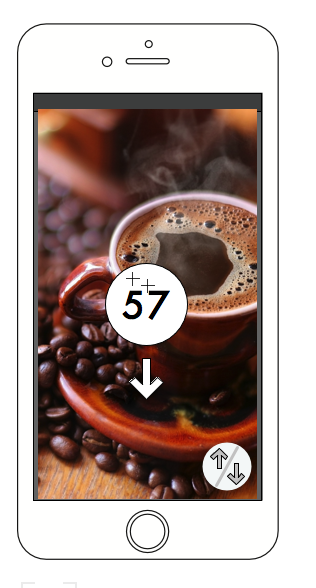
I want my counter to “spin” to the current number when the app is opened. This should happen in three seconds regardless of the number. So if the counter is at 5, then it would take three seconds to arrive at 5. If the current number is 75, then it will take three seconds to arrive at 75.

I thought it would also be nice to give the option to add a background image to remind the user what they are counting for.


Designing Meaningful Interactions

IMG_5587IMG_5587This week we looked at some interactions that we enjoy and don’t enjoy.

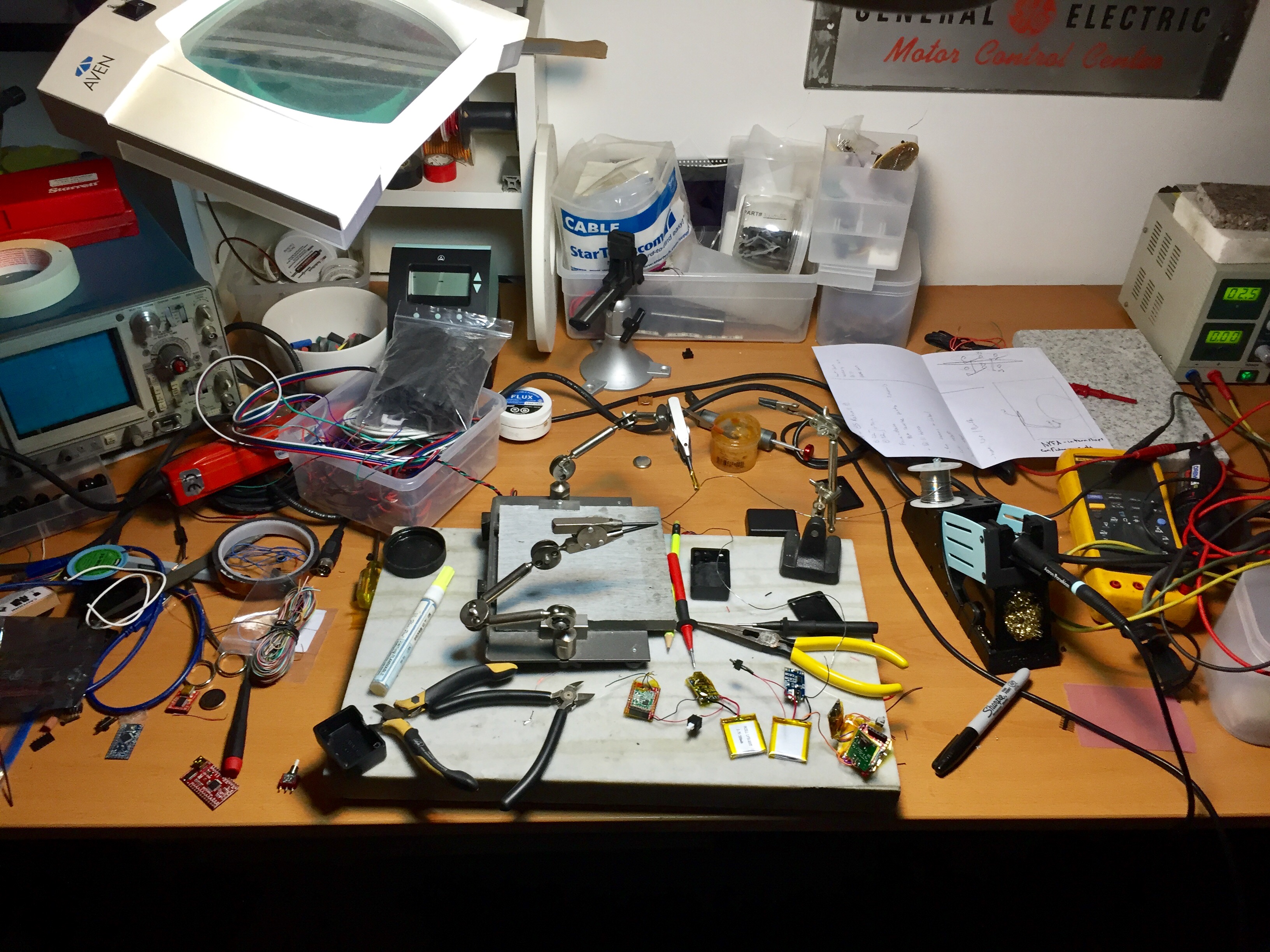
In my personal work, I end up using a lot of different hand tools. Most of them have interactions that I love, as I’ve stuck with things I like and gotten rid of things I don’t.

One of my favorite interactions for a tool is one of my screwdrivers made by Wera:

https://vimeo.com/202061123

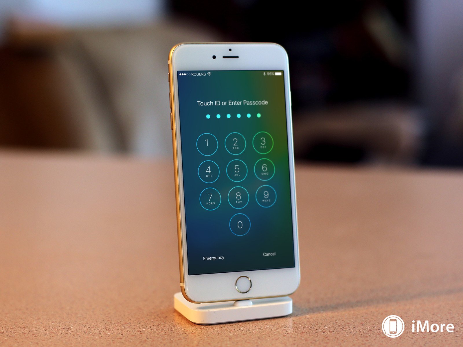
One interaction I cant stand is the new unlock interface on the iphone

I really miss the sliding touch from the interface. Now there are too many controls from the one button. I find it very cluttered and hard to operate when Im walking or multitasking. The basic operation is lost because of this, which is to unlock the phone.

Why is this interface gone?

Tangible Interaction Workshop

This week we designed an interface for the flash game lunar lander:

https://www.atari.com/arcade#!/arcade/lunarlander/play

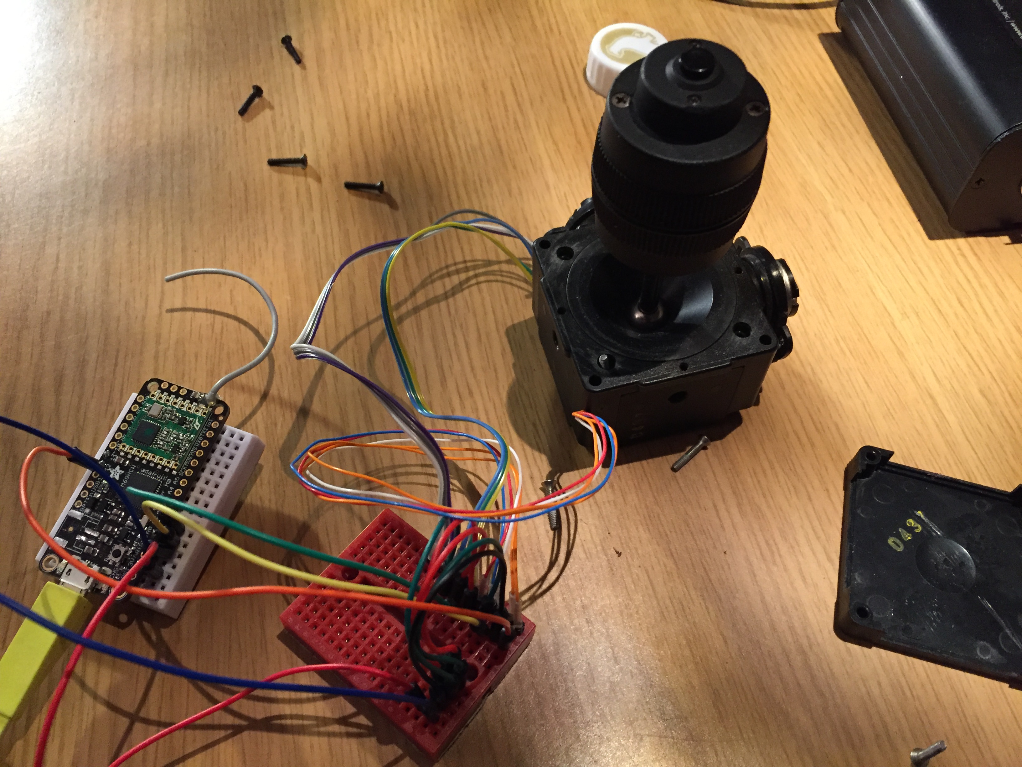
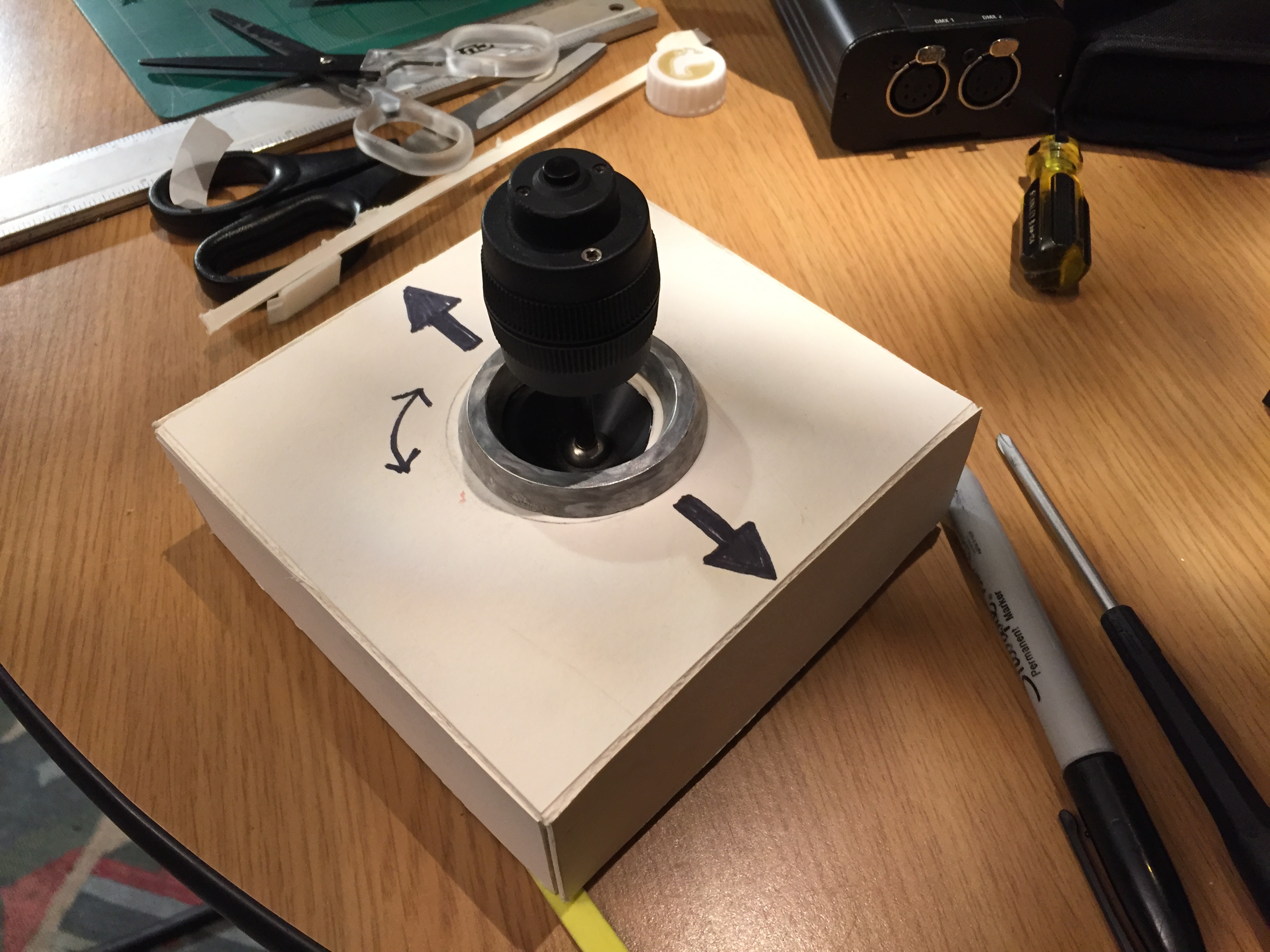
I decided to use a joystick I had found on a trashed analog video switcher (think star wipes and word art titles of the 90’s). The joystick has a shuttle wheel mounted on its stem, which seemed great for rotating the spaceship. It also has a little button on top of the shuttle wheel that I figured would be great for the escape key (spacebar).

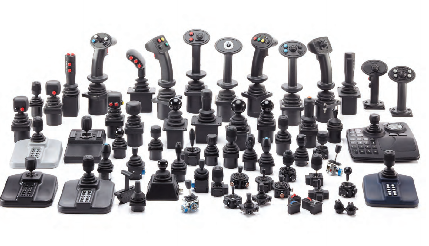
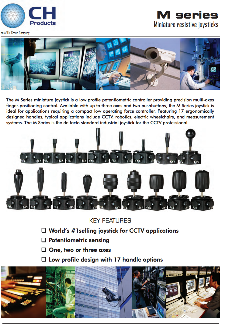
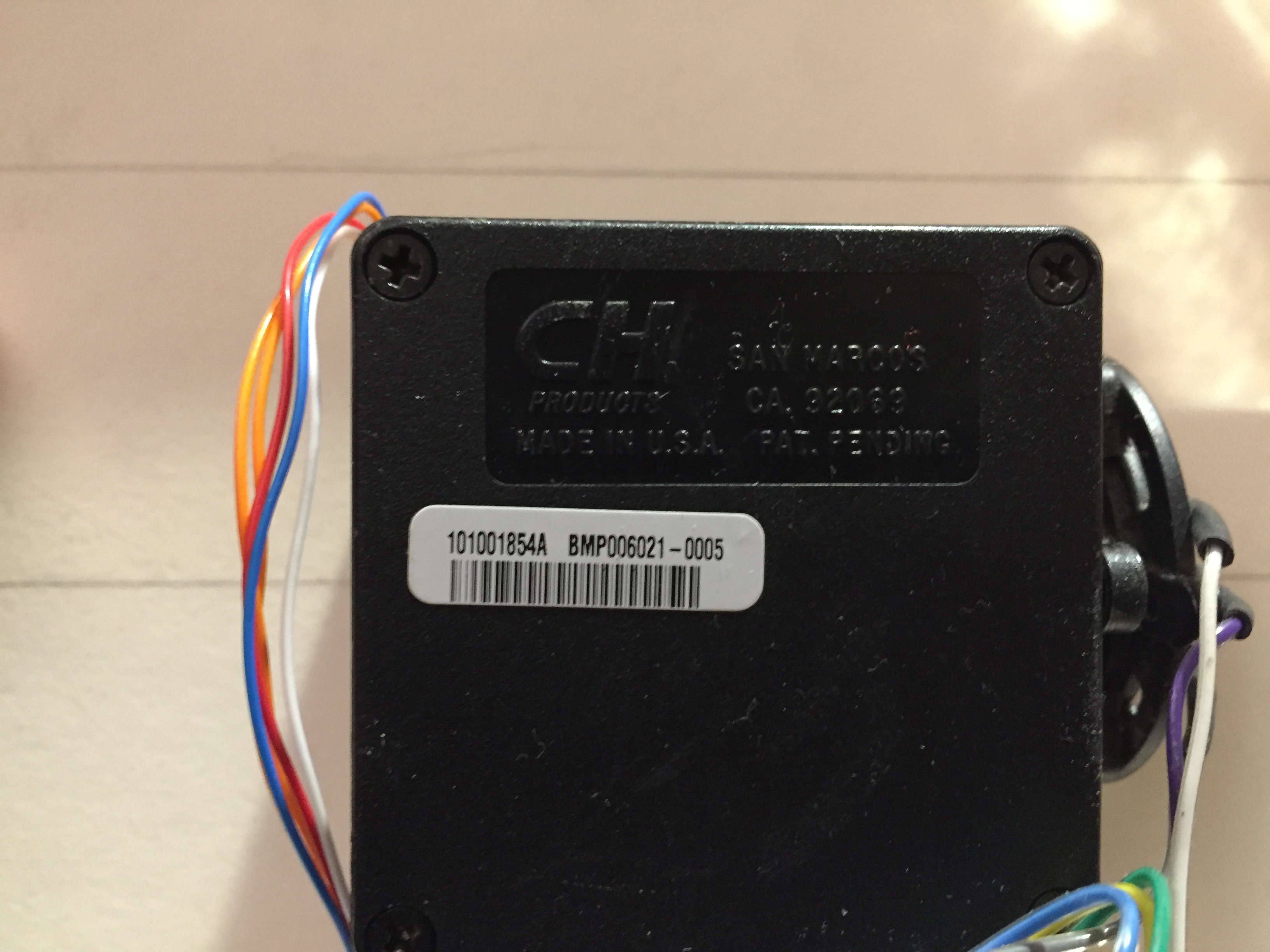
The joystick is made by CH Products in America. It turns out they make some amazing joysticks! Construction / farm equipment and CCTV / video, and flight sims. seem to be the main uses.


LOTs of joysticks . . .

A quick scroll through their website and I found mine:

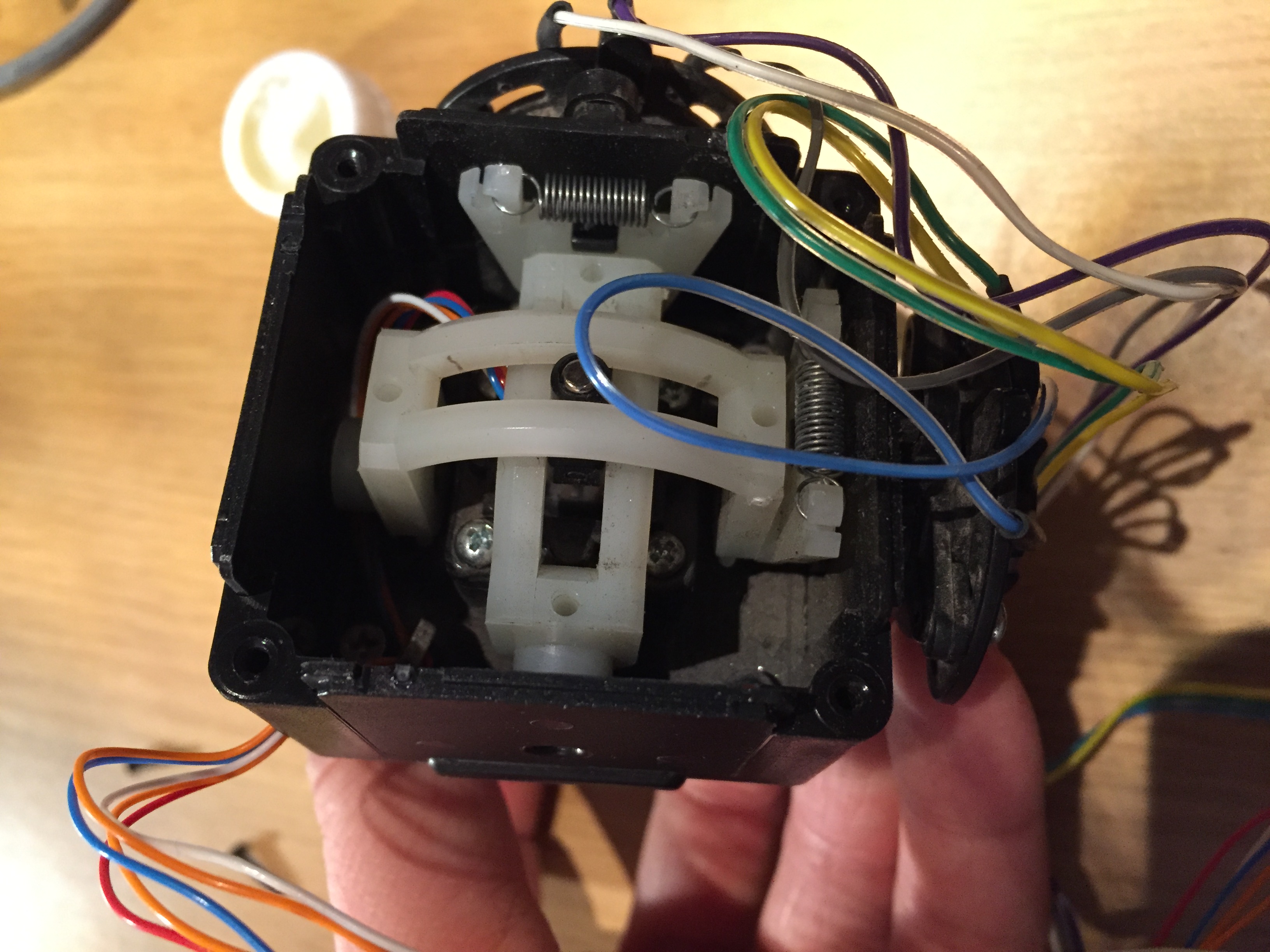
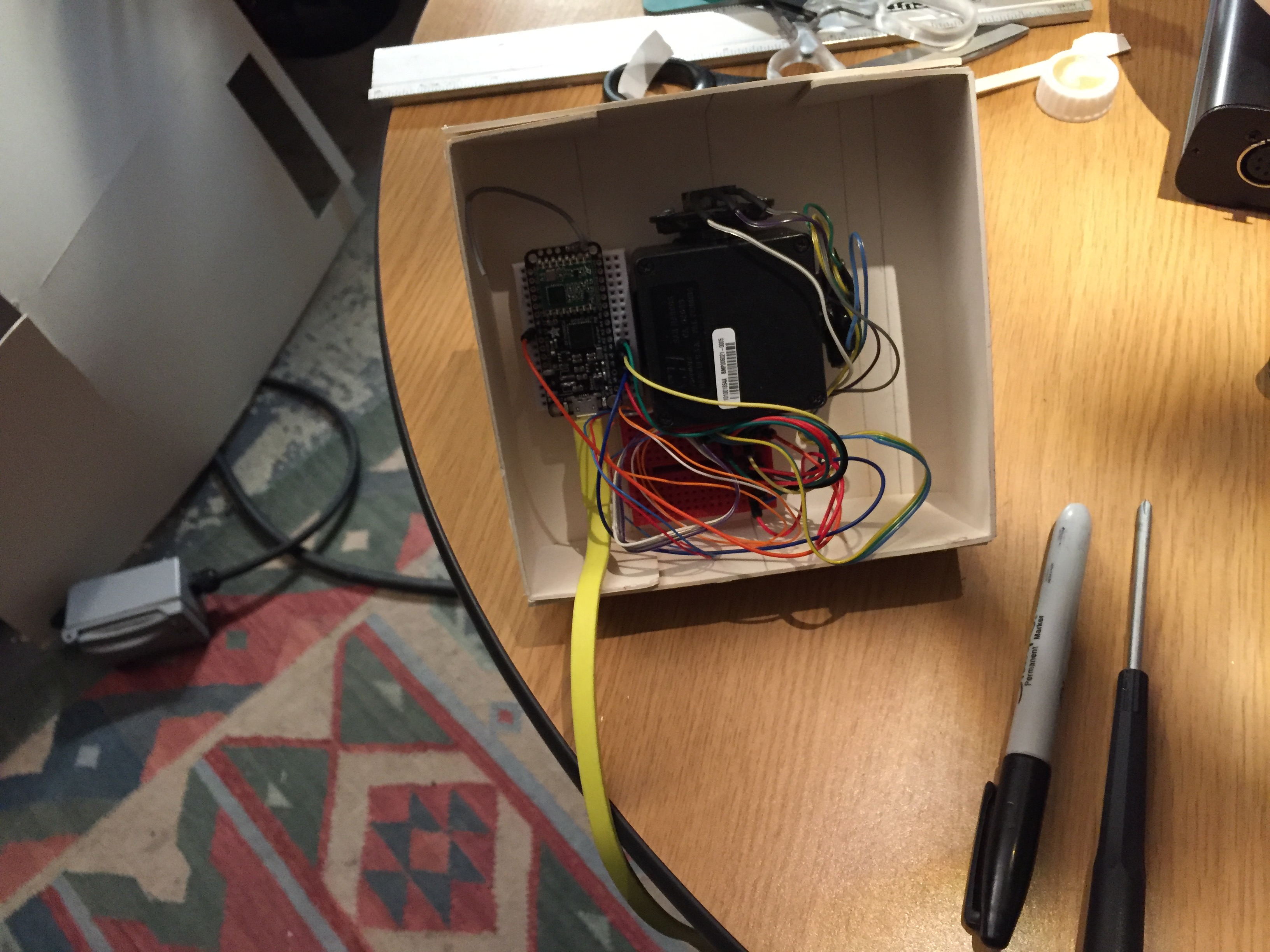
It has two 5K ohm potentiometers for x and y on the joystick, and a third for the shuttle wheel.

Lots of springs to bring everything back to center


Here is my code to get it to send keyboard keys via USB. (‘w’, ‘a’, ‘s’, ‘d’)

Here is the “finished” product!